Wednesday, 25 April 2012

A mental vacation from my work

OLEG DOU


" Born in 1983 in Moscow.

As his mother was a painter and his father was a dress designer, in his childhood Oleg Dou used to gather with the artists and to spend a lot of time reading is father’s fashion magazines. At the age of 13, his parents offered him his first computer set up with an old version of Photoshop with which he already began to transform his school friends or teachers faces. After studying design, he worked as a web designer. In 2005, he buys his first professional camera.

He is one of the most promising artist of his generation. In 2011, the Artprice company, leader of the information on art value, has graded Oleg Dou in the top 3 of the under 30 years old photographers the best saled in public auctions. One of his images will make the cover of an extensive " Frozen Dream, contemporary art from Russia" book, from Trans Globe Publishing and Thames & Hudson.

Oleg Dou lives and works in Moscow". Gallery notes


Very surreal, outsider art, extremely brilliant use of digital manipulation. It's not fashion, portrait or graphics but a strange combination of all three. I saw his work four years ago when we did an exam question " Identity". It made a great discussion topic. I have posted it because after the tutorial my head is full of conflicting ideas and ways forward, this work is as different to my own as it is possible to be. Mental vacation!


Urbed Bus Tour


I went on the Urbed bus tour organised by Emily Crompton who did a talk the other day. Urbed specialise in urban design and sustainability. 
It was a brilliant 3 hour tour on a lovely old London Bus, with a running commentary from the bus driver who also works for Urbed and knows Manchester like the back of his hand, and of course the very lively Emily, who obviously loves her new job.


Our transport
Whilst waiting to go, I noticed the detail above the Holden gallery doorway, its beautiful.


You will have to excuse the quality of these pictures as they are taken through a grubby window of a moving bus.

This is Moss Side where there is a lot of house regeneration, the old houses have been flattened, and replaced with new, all except this one on the right, where the owner has refused to move.


At the end of each row of terraced houses, are these white ultra modern buildings, I'm not convinced.


A grand old building in need of a bit of TLC


"Skyhook" by Brian Fell


This sculpture is quite fascinating self supporting representing the past industrial area of Salford Quays area


The imperial War Museum - apparently the building is supposed to represent a broken cup and saucer!!?
The bridge linking the new "Media City",

everything feels ultra modern and squeaky clean


BBC offices

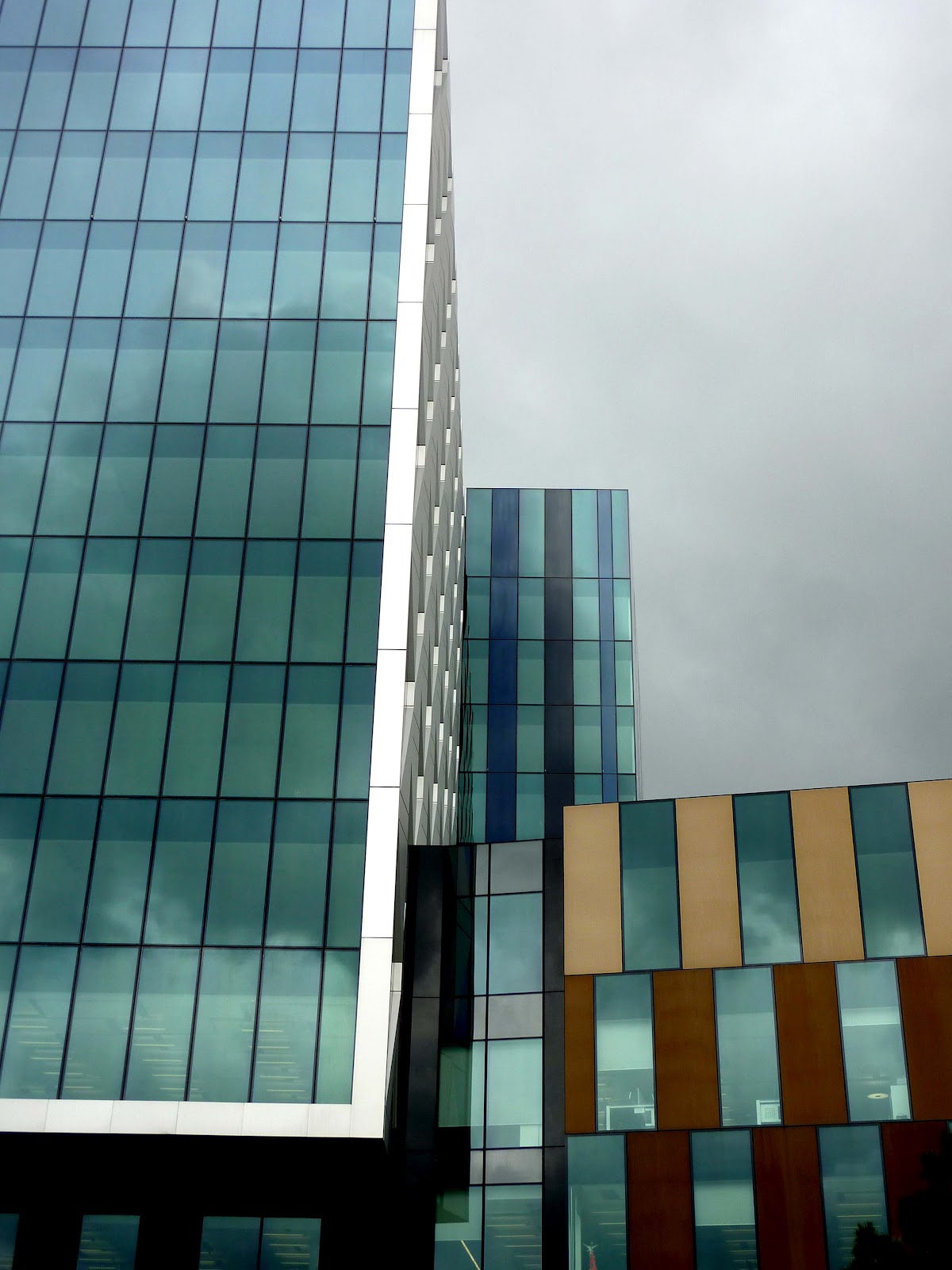
 Buildings in Media City, Its nice to see a bit of thought has gone into the design process, the one below could almost be mistaken for Lego.


One of the many old bridges


I love this old building, it has so much potential, it appears to be one of the old cotten mills, which will probably turn into new apartments eventually, this seems to be the way for most of these buildings, I love the blue against the brickwork.


New Next to old, and the waterway system which bought much wealth to Manchester in the cotton industry.


I find it interesting the new next to old, there is a lot of it in Manchester. The starkness of the modern buildings almost offsets the lovely architecture and character of the older building.


This is is a Premier Inn an ugly building, but kind of interesting "pod like" windows


Another large glass house- looks fragile


One of the shop windows in the Northern Quarter


I apologise for going a bit crazy on the photos, I just get a bit excited!
The trip was a great experience and opportunity to get some inspiration for Unit X, and to view it from the upper deck of the bus was a bonus.  I know that I'm feeling the pull from the detail of the historic parts of the city.

Stockport Air Raid Shelter


Stockport air raid shelters is a network of tunnels, nearly a  mile long, was cut out of the red sand stone hills on which Stockport stands, to provide shelter for 6,500 during the Second World War.

The shelters were fitted with basic amenities:electric lights, benches and bunk beds, flushing toilets, first aid post and sick bay - there were even facilities for nursing mothers.


I found it difficult to imagine such vast numbers in such a claustrophobic space, the tunnels were seven feet wide and high, there would have been benches or bunk beds lining either side of this wall surrounded by masses of bodies, children crying, frustrated parents, anxious people not knowing what they would face when emerging from the tunnels.


So much for a bit of privacy! These toilets were basically just part of one large pipe with holes in the top, the smell must have been pretty bad!

Apparently Stockport people say that the bulk of the space in the tunnels was taken up by Manchester folk who had been bombed out of their homes, and that Stockport residents were unable to get in as they weren't given priority, they required a ticket to access the tunnels, hard to imagine checking tickets in the panic of a raid. 
 An example of the posters used in the war, the hats are very fetching!

Saturday, 21 April 2012

Christine Toh

Hey girls, I came across this textiles artist in The Royal Exchange. Her work was being sold in the gift shop, including her Print work on fashionable scarves. I looked her up online and found some of her other work appealing. Her collage work is a great way to start drawing, especially when it comes to designing a silk screen for print. Louise I remembered your large drawings you showed us this week in our tutorial, and Tohs work reminded me of yours. Your mark making that you then interpreted further into photoshop was brilliant and I think Toh may be an inspiration to you as she is to me with her print work. Let me know what you think. PS Please excuse the bad pictures, follow the link to see the images better.


Chidren's book illustrations, realism and fantasy

After seeing the delightful book illustrations posted by Pip, I thought you may like these by my favourite illustrators.


"There is almost nothing that has such a keen sense of fun as a fallen leaf " 1906 by Arthur Rackham
Illustration for J. M. Barrie's novel "Peter Pan in Kensington Gardens" published in 1906. Watercolour, pen & ink

The Snow Queen by Edward Dulac Edmund Dulac’s Stories from Hans Anderson 1911

He worked in watercolour, and later taking advantage of the new print technology ( no need for black outlines to cover poor colour registration) he used coloured inks.


The Lantern Bearers by Maxfield Parrish, 1908, Collier's Magazine
 
Oil on canvas on board, the painting shows Parrish's use of glazes and saturated colour in an evocative night scene. " He would build up the depth in his paintings by photographing, enlarging, projecting and tracing half- or full-size objects or figures. Parrish then cut out and placed the images on his canvas, covering them with thick, but clear, layers of glaze. The result is realism of elegiac vivacity. His work achieves a unique three-dimensional appearance". Wikipedia
 
I wonder what his work would look like if he had access to Adobe Photoshop


Renate Meyer "Lost in Thought"  Screen print inks
 
There is very little information about Meyer, she was married to Charles Keeping, an influential children's book illustrator. Her technique is fabulous, unusual, up close it looks like mono print, collage and rubbings, but I am guessing! She has curated a gallery of their work. I think her apples are very clever and skillfully made. She exhibits them in tiny fruit boxes in rows and stacked on shelves.


Thursday, 19 April 2012

Feeling Like Home


Concentrating so much on the Manchester as a City, I tend to miss me home a lot outside the City on the Northern Island. Dining out in Restaurants like these one makes me remember the taste of home cooked food and being around the warmth of of your family. Take half an hour and phone your Family. 

Secret stories and wishes for Hannah

Shelly Goldsmith


I just remembered the lecture by Shelly at the start of the unit. She did some very thoughtful work for an installation, (see link below for more detail). What I was intrigued by was her use of stitch, reclaimed garments and secret stories / messages to make an installation in a pub, based on two historical lovers. Her work may inspire you or connect to your wishes idea. She puts equal effort and thought into the concepts as in the finished textile pieces. She can work on an idea for several years before actually completing it!


http://publicarthouse.tumblr.com/post/11866314269/shelly-goldsmith-the-lovers